Best landscape photos for branding
You’ll learn how to match colors, composition, and style to your brand identity, and how to choose images that work across your website, social media, and marketing materials.
Joe
1/31/20264 min read
Landscapes are powerful branding tools. Used well, they instantly communicate mood, values, and lifestyle without feeling “salesy.” Used poorly, they look like generic stock and weaken your brand. This guide shows you how to choose and use landscape photos so they feel uniquely “you” and work for both editorial and commercial use.
1. Start with your brand personality
Before picking any photo, define what your brand feels like:
Adventure & energy – bold, dramatic mountains, cliffs, stormy seas, strong contrasts.
Calm & wellness – soft light, lakes, forests, mist, pastel skies, wide open space.
Luxury & exclusivity – clean compositions, sunset/golden hour, premium locations, minimal clutter.
Urban & modern – city skylines, architecture, roads, light trails, graphic lines.
Ask: If my brand were a place, what would it look like?
That “place” is the landscape style you should consistently use.
2. Choose the right type of landscape image
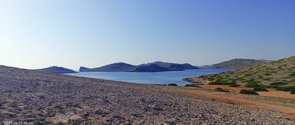
A. Wide, open vistas (hero images)
Best for: Homepages, hero sections, large banners.
Look for:
Wide-angle views: mountains, coastlines, deserts, open fields.
Clear focal point but plenty of negative space for text.
Simple, uncluttered foreground.
These images create a sense of scale and possibility – ideal for brands that want to feel expansive, ambitious, or freeing.
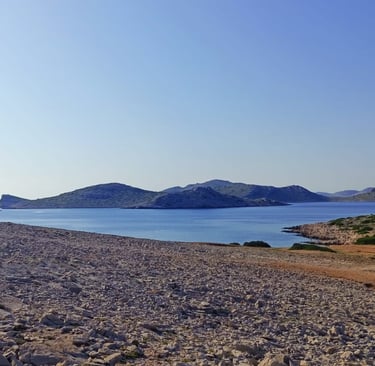
B. Detail-focused landscapes (supporting visuals)
Best for: Blog headers, section backgrounds, social posts.
Look for:
Close-ups of textures: sand, rocks, grass, water, tree bark.
Cropped scenes: a path through a forest, a section of coastline, a portion of a mountain.
Strong patterns or repeating shapes.
These are perfect for adding atmosphere without distracting from your message or text.
C. Landscapes with people (lifestyle branding)
Best for: Brands that sell experiences, travel, outdoor gear, coaching, or wellness.
Look for:
Small human figures in a big landscape (person on a cliff, walking a trail, by the sea).
Natural, candid poses (looking at the view, walking, sitting) rather than “posing for the camera.”
Composition where the person supports the story but the landscape still dominates.
For commercial use, ensure you have model releases for recognizable people.
3. Color and mood: matching your visual identity
Your landscape photos should support your brand colors and emotional tone.
Warm tones (gold, orange, red): sunsets, autumn forests, desert light.
Feels: welcoming, energetic, passionate, optimistic.
Cool tones (blue, teal, green): oceans, lakes, forests, twilight.
Feels: calm, trustworthy, refreshing, professional.
Muted tones (fog, overcast, pastel): misty mountains, cloudy coasts, soft sunrises.
Feels: minimal, refined, introspective, premium.
High contrast (bright light + deep shadows): harsh sun, dramatic weather, storms.
Feels: bold, edgy, adventurous, intense.
Pick 1–2 main moods and stick to them across your website, social media, and printed materials. Consistency is more important than “perfect” individual photos.
4. Composition tips for branding use
A. Leave space for design
For headers, banners, and social graphics, you need room for titles, logos, and buttons.
Choose images that:
Have a natural empty area (sky, water, fog, plain sand, a wall).
Don’t place the main subject exactly in the center where your text must go.
Work well when cropped to common ratios (16:9, 4:5, 1:1).
If an image only works uncropped, it’s harder to reuse across designs.
B. Simple beats busy
Busy landscapes (dense forests, crowded beaches, messy city scenes) can look beautiful on their own but chaotic in branding.
Prefer:
Clear horizon lines.
One main subject (a peak, a tree, a curve of shoreline).
Limited color palette (two or three dominant colors).
This makes your layouts cleaner and your message easier to read.
5. Editorial vs commercial use for landscape branding
Because you’ll use these images to build your brand, most of your uses are commercial, not editorial.
For commercial use (websites, ads, packaging, social campaigns):
Prefer images where people (if present) are either:
Not recognizable (small silhouettes, backs turned, far away), or
Have proper model releases.
Avoid close-up trademarks or recognizable private property unless you have a property release.
Choose images that don’t suggest a specific competing brand or product.
For editorial use (blog posts explaining concepts):
You can use more documentary-style images (real locations, real people) to illustrate ideas.
Make sure the context is informational, not selling.
Do not imply endorsement (e.g., “this person uses our product” if they don’t).
For a blog post titled “Best Landscape Photos for Branding”, you can safely use editorial-style landscapes to illustrate your points, as long as the post itself is educational, not an ad.
6. Where to use landscape photos in your branding
Homepage hero – One strong landscape that expresses your brand promise in a single glance.
Section backgrounds – Softer, lower-contrast landscapes behind text blocks.
About page – A landscape that reflects where your story comes from (e.g., your region, typical travel destinations).
Blog posts – Themed landscapes that match each article’s topic and mood.
Social media – Cropped variations and details to keep a cohesive visual feed.
Reuse the same 5–10 core images across multiple places to feel consistent rather than random.
7. Checklist: is this a good landscape photo for my brand?
Before you choose an image, run through this quick list:
Does the mood fit my brand personality?
Do the colors support or clash with my brand palette?
Is there enough empty space for text and design?
Is the composition simple enough for quick understanding?
Is it safe for commercial use? (releases, trademarks, private property)
Can I crop it to different formats (web, mobile, social) without losing the subject?
Would I be happy to see this image representing my brand for the next 2–3 years?
If you can say “yes” to most of these, it’s a strong candidate.
Kultariro
Embracing yesterday, today and forever!
Contact
Newsletter
sales@kultariro.com
© 2026. All rights reserved.